We are a digital agency helping businesses develop immersive, engaging, and user-focused web, app, and software solutions.
2310 Mira Vista Ave
Montrose, CA 91020
2500+ reviews based on client feedback
What's Included?
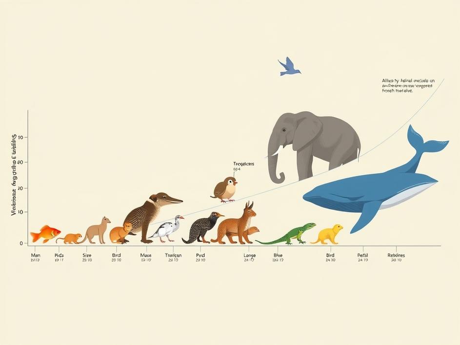
ToggleWhen we look at animals, two things jump out: how big they are and how long they live. Those numbers are not random. They are clues about how each species fits into its world. A tiny mouse that lives a year or two has a very different strategy than a massive whale that can outlive a human by decades. In the MiniViz May challenge, participants had to pull data from many vertebrates and turn it into a visual story. The goal was to see patterns that link body size to life span across fish, birds, reptiles, and mammals. By doing that, we can learn how evolution shapes the trade‑offs between growing big and staying alive long.
The data set used in the challenge came from public databases that track animal traits. It includes measurements like weight, length, and estimated maximum age. The numbers are messy – some species have precise records, others are guesses based on a few observations. Participants had to clean the data, fill gaps, and decide how to compare species that live in very different environments. The result is a table that spans everything from the tiny goldfish to the gigantic African elephant. Getting that table ready took time, but it gave a solid base for any visual analysis.
When you plot size against longevity on a log‑log scale, a clear curve appears. Small animals cluster on the lower left, big animals on the upper right. But the curve is not a straight line. There are bumps where certain groups deviate. Birds, for example, often live longer than you would expect for their size. Some reptiles sit above the curve, showing that a moderate body can still enjoy a long life. Those outliers are the most interesting because they hint at special adaptations – low metabolism, protective shells, or unique reproductive strategies.
Take the naked mole‑rat. It weighs only a few dozen grams but can live more than 30 years, far beyond the typical lifespan for a rodent. Its secret lies in a low‑oxygen lifestyle and a resistance to cancer. Another example is the albatross, a bird that can soar for years without landing and live up to 60 years. Its large wings reduce energy use, letting it survive on a diet of fish and squid. These cases show that size is only part of the story. Metabolism, environment, and evolutionary pressures all play a role.
Understanding the link between size and lifespan helps us protect species better. Large, long‑lived animals tend to reproduce slowly. If a population is hit by hunting or habitat loss, it takes a long time to bounce back. Small, short‑lived species can recover faster, but they are also more sensitive to rapid environmental changes like pollution. By seeing where a species sits on the size‑longevity curve, managers can estimate how vulnerable it might be to threats and plan actions accordingly.
Working through the MiniViz challenge was a reminder of how simple numbers can tell complex stories. The data cleaning part felt tedious, but once the plot came together, the patterns were striking. It reinforced my belief that visual tools are powerful, not because they look fancy, but because they make hidden relationships obvious. I also realized that we need more high‑quality data, especially for less‑studied animals. The better the data, the clearer the picture we can draw about life on Earth.
Size and longevity are more than just statistics. They are windows into how animals have adapted to survive and thrive. The MiniViz May challenge showed that when you line up many species on a single chart, you can see the fingerprints of evolution, ecology, and even human impact. As we keep gathering data and building better visuals, we’ll keep learning new lessons from the animal kingdom. Those lessons can guide research, conservation, and our own curiosity about the natural world.


Comments are closed