

We are a digital agency helping businesses develop immersive, engaging, and user-focused web, app, and software solutions.
2310 Mira Vista Ave
Montrose, CA 91020

2500+ reviews based on client feedback
What's Included?
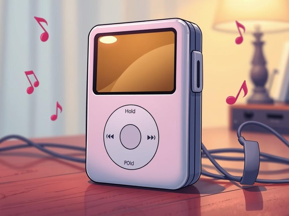
ToggleWhen the first iPod hit the shelves in 2001, most people focused on its sleek shape and the promise of a thousand songs in your pocket. Yet there was a tiny, unassuming toggle on the side that quietly defined how users interacted with the device. That little switch, often called the Hold or Lock button, gave the iPod a sense of seriousness that other players lacked. It let you pause the whole system with a flick, preventing accidental skips while you were on a bus or in a crowded room. The simplicity of that function still feels relevant today.
Back then, the iPod’s internals were modest. The scroll wheel, a tiny LCD, and a modest processor meant the device couldn’t afford a full‑blown operating system like today’s smartphones. Engineers needed a way to keep the player from reacting to every stray touch. By wiring a mechanical switch to the main power line, they created a hardware‑level lock that didn’t rely on software. This decision saved battery life and kept the user experience predictable, turning a constraint into a purposeful design element.
Imagine you’re jogging and the iPod’s wheel gets bumped. Without a lock, the song could jump forward, ruining the flow. The Hold switch let you lock the wheel with a quick push, so the device stayed put until you were ready. It also gave a clear visual cue: the button’s position told you at a glance whether the player was active. That tactile feedback made the iPod feel like a tool you could trust, not just a gadget you fiddled with.
Many MP3 players of the early 2000s relied on soft‑key menus or simple play/pause buttons. They often lacked a dedicated lock, meaning users had to be constantly careful with their thumbs. Some tried software locks, but those drained more power and could be confusing. Apple’s hardware switch stood out because it was instant, required no extra battery, and fit neatly into the device’s minimalist aesthetic. It gave the iPod an edge that went beyond storage capacity.
As the iPod line grew, the Hold switch traveled with it. The original 5‑gen iPod kept the same side toggle, while the iPod Mini tucked it into a slimmer profile. Even the later iPod Nano, despite shrinking to a fraction of the original size, retained a version of the lock, though it became a press‑and‑hold on the click wheel. Each iteration showed that Apple wasn’t just slashing features for size; they were preserving a piece of the user experience that had proven its worth.
Beyond the technical side, the Hold switch gave users a feeling of control. In a world where devices were becoming more complex, having a single, physical button that could stop everything was reassuring. It reminded people that they could still dictate how technology behaved, rather than being at its mercy. That sense of agency is something designers still chase, but often hide behind software menus that can be harder to locate.
Today’s smartphones and wireless earbuds don’t usually have a dedicated lock switch, yet the idea lives on. Many devices use “Do Not Disturb” modes or lock screens that mimic the same principle: a quick way to pause interruptions. Even the Apple Watch’s “Theater Mode” echoes the same desire to freeze notifications with a simple gesture. The original iPod’s switch set a precedent that the best controls are often the most straightforward.
Looking back, the Hold switch teaches a simple lesson: great design often solves a problem that users haven’t even voiced yet. By anticipating accidental touches and offering a hardware fix, Apple removed friction before it became a complaint. It also shows that not every feature needs to be flashy; sometimes the quiet, reliable ones win the day. For anyone building products, that’s a reminder to listen to the context in which the product will be used.
The Hold switch may seem like a footnote in the iPod’s story, but its influence stretches far beyond a single button. It helped shape the way we think about user control, battery efficiency, and tactile feedback. While newer devices have moved to software solutions, the principle remains: give users a clear, immediate way to pause the world when they need it. That tiny toggle helped the iPod become more than a music player; it became a trusted companion, and its legacy lives on in the subtle ways we design interaction today.
Source: Original Article


Comments are closed