We are a digital agency helping businesses develop immersive, engaging, and user-focused web, app, and software solutions.
2310 Mira Vista Ave
Montrose, CA 91020
2500+ reviews based on client feedback
What's Included?
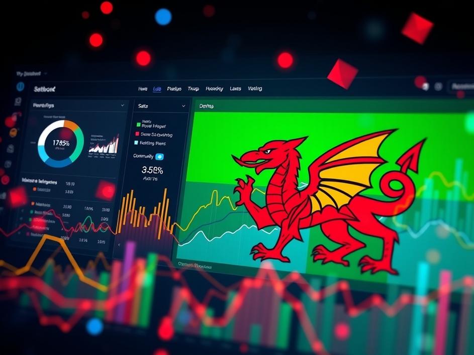
ToggleMicrosoft Fabric and Power BI are buzzing with activity, and one exciting event on the horizon is the Microsoft Fabric & Power BI Wales User Group’s June gathering. While the announcement focuses on a local user group, the event itself is online, opening doors for anyone interested to attend! These user groups are a fantastic way for data enthusiasts to connect, learn, and share their experiences with the tools. This particular event offers the opportunity to directly engage with Fabric product managers, giving attendees a rare chance to influence the future direction of the platform. It’s also a great way to participate in targeted feedback sessions, ensuring that the platform evolves to meet the needs of its users. User groups are invaluable resources. They’re not just presentations and demos; they are community hubs where real-world challenges are discussed and innovative solutions are born. And that is something to get excited about.
But the real excitement stems from the upcoming Power BI Dataviz World Championships! Four finalists are gearing up for the ultimate data visualization showdown. This contest highlights the creative potential within Power BI, showcasing how data can be transformed into compelling and insightful stories. These aren’t your everyday bar charts and pie graphs; these finalists are pushing the boundaries of visual communication, crafting interactive dashboards and engaging reports that capture attention and deliver impactful insights. It’s a chance to see what’s truly possible with the platform. I believe it’s important to note the skill and dedication required to reach this level. Data visualization is more than just picking pretty colors; it’s about understanding the underlying data, identifying key trends, and presenting information in a way that is both accurate and easily understood. It requires a blend of analytical thinking, design skills, and storytelling ability.
The Power BI Dataviz World Championships isn’t just a competition; it’s a catalyst for innovation. By showcasing the incredible work of these finalists, Microsoft inspires others to explore the creative potential of Power BI. It encourages users to move beyond the standard templates and experiment with new techniques, ultimately leading to more effective data communication. And that can only be a good thing. The benefits extend beyond individual users, too. Organizations that prioritize data visualization gain a competitive advantage. They can communicate insights more effectively, identify opportunities more quickly, and make better-informed decisions. It transforms raw data into actionable knowledge, empowering teams to drive growth and improve performance. The championship also serves as a platform for these talented individuals to gain recognition for their skills and expertise. It opens doors to new opportunities, allowing them to share their knowledge with a wider audience and contribute to the advancement of the field. This is a great thing to see.
Let’s be clear: data visualization is far more than just creating visually appealing charts. It’s about understanding the story the data is trying to tell and presenting it in a way that resonates with the audience. A good data visualization should be clear, concise, and engaging, guiding the viewer through the data and highlighting the key insights. It should also be accurate and unbiased, avoiding any misleading or manipulative representations. Think of it as translating complex information into a language that everyone can understand. This makes data more accessible and empowering individuals to draw their own conclusions and make informed decisions. In a world drowning in data, the ability to visualize information effectively is becoming an increasingly valuable skill. It bridges the gap between raw data and actionable knowledge, unlocking insights that would otherwise remain hidden.
So, what does this all mean for you? Whether you’re a seasoned Power BI expert or just starting your data journey, there are valuable takeaways from both the Wales User Group event and the Dataviz World Championships. The user group provides a fantastic opportunity to connect with other enthusiasts, learn from experts, and share your own experiences. The championship serves as a source of inspiration, showcasing the creative potential of Power BI and encouraging you to push the boundaries of your own data visualization skills. And remember, data visualization is a journey, not a destination. It’s a continuous process of learning, experimenting, and refining your skills. Embrace the challenge, explore new techniques, and don’t be afraid to experiment. By doing so, you can unlock the power of data and transform it into meaningful insights that drive positive change.
The Microsoft Fabric & Power BI Wales User Group event, and especially the upcoming Power BI Dataviz World Championships, highlights a crucial trend: data is becoming increasingly visual. As the volume of data continues to grow exponentially, the ability to effectively communicate insights through visual representations is more important than ever. These events not only celebrate the creativity and skill of data visualization professionals but also serve as a reminder of the power of data to inform, inspire, and drive action. As we move forward, expect to see even greater emphasis on data visualization tools and techniques, empowering individuals and organizations to unlock the full potential of their data. So, keep learning, keep experimenting, and keep visualizing!


Comments are closed